What this test can and can’t tell you
Color accuracy is measured as ΔE (Delta E): how far each displayed color is from the color it should be. Measuring that needs a colorimeter, because a web page can only send color values, never see what light comes out of the screen. What your eyes can judge reliably are the errors that matter most in daily use:
- a color cast in grays (a cool blue, green or magenta tint, or a tint that changes from dark to light),
- oversaturation (neon reds, orange skin) from vivid modes or wide-gamut panels showing sRGB unconverted,
- clipping, where the most saturated steps of a color merge,
- and colors that simply look wrong — sky that is purple or cyan, foliage that glows.
How to run the color accuracy test
- Set the display up for accuracy. Use the sRGB, Natural or Filmmaker/Movie mode. Turn off Night Light (Windows), Night Shift and True Tone (Apple), eye-comfort and blue-light filters, and auto-brightness. Let the screen warm up for 15–30 minutes and calibrate brightness and contrast first.
- Start with grays. Press 2. The smooth ramp and the ten steps should look neutral all the way from black to white. Look especially at the dark and mid steps, where tints are easiest to see.
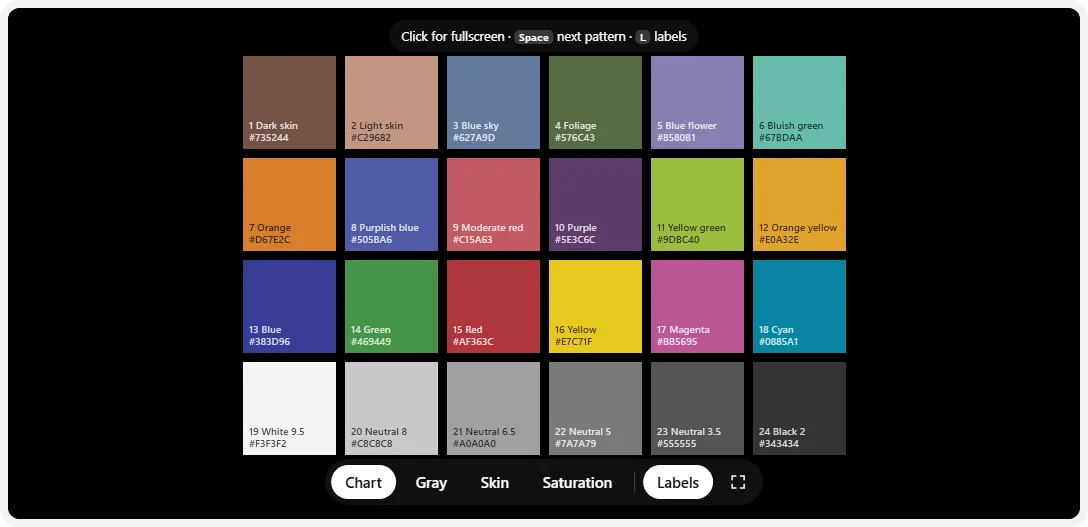
- Inspect the chart. Press 1. Check the bottom gray row, the skin patches top left, and the blue sky and foliage patches. Press L to hide or show patch names and values.
- Check skin tones. Press 3. The ten Monk Skin Tone references and the two ColorChecker skin patches should look like real skin, from very light to very dark — not orange, pink, green or gray.
- Check saturation. Press 4. Each row goes from 10% to 100% saturation. All ten steps should be distinct; if the last two or three merge, the display is clipping saturated colors.
- Compare with a trusted screen if you have one — a recent iPhone, iPad or MacBook in its default mode is well calibrated from the factory. Open this page on both and look at them side by side at similar brightness.
- 1Patch number, name and hex value — press L to hide labels for a clean view.
- 2The four patterns: chart, gray neutrality, skin tones and saturation (keys 1–4).
- 3Labels on or off.
Reading each pattern
Gray neutrality
Grays are the most sensitive test of color accuracy: any imbalance between red, green and blue shows up as a tint. A uniform cool (bluish) tint means a color temperature above 6500K — switch to 6500K, Normal or Warm. A green or magenta tint usually means a picture mode or panel issue; with User RGB gains, lower the gain of the color you see. A tint that changes with brightness (warm shadows, cool highlights) is a grayscale tracking error that only a measured calibration fixes properly. If the grays look blotchy rather than tinted, check gray uniformity instead.
ColorChecker chart
The chart reproduces the 24 patches of the ColorChecker Classic using its published sRGB values. Things to check:
- Bottom row: six neutral steps from near-white to dark gray, evenly spaced and with no tint.
- Natural colors (top row): dark and light skin look like skin; blue sky is a soft mid blue, not purple; foliage is a muted olive green, not bright.
- Similar pairs stay apart: Blue (13) vs Purplish blue (8), Orange (7) vs Orange yellow (12), Moderate red (9) vs Red (15).
- Primaries and secondaries (third row): strong but not neon. Glowing reds and greens suggest a wide-gamut panel showing sRGB without conversion.
Skin tones
People are extremely sensitive to skin color. Oversaturated displays push skin toward orange or red, cool white points make it look gray and pale, and wrong tint pushes it green or magenta. The skin view uses the ten colors of the Monk Skin Tone scale plus the ColorChecker skin patches, on a neutral 50% gray background that doesn’t bias your eye.
Saturation steps
Each step adds 10% saturation at full brightness. On a good display all ten are distinct in every row. Merged top steps mean saturation is being clipped (often by a Vivid mode or a saturation slider above default); a whole row that looks neon from 50% upward points to an oversaturated, unmanaged wide gamut. To see whether your display can show colors beyond sRGB, use the color gamut test.
Wide-gamut monitors: why sRGB content can look wrong
Many newer monitors, laptops and phones cover DCI-P3 or Adobe RGB, which include more saturated colors than sRGB. Websites, Windows, games and most photos are made in sRGB. If the system or app doesn’t convert sRGB to the panel’s wider primaries, every color is stretched outward: reds turn neon, skin turns orange, and greens glow.
- Monitor sRGB mode: the simplest fix. Often called sRGB, sRGB Clamp or sRGB emulation. Some monitors lock brightness in this mode.
- Windows 11: on supported hardware, Automatically manage color for apps (Settings → System → Display → Color profile / Color management) converts content to the display’s gamut. Otherwise only color-managed apps (Photoshop, Lightroom, Chrome, Edge) convert correctly.
- macOS, iOS and Android: color-managed system-wide; colors are accurate as long as the display profile is right.
Reference values
The 24 chart patches in sRGB (D65), the commonly published values for the ColorChecker Classic. These are the values sent to your screen; small differences between published sets come from measuring different physical charts.
| # | Patch | sRGB | Hex |
|---|---|---|---|
| 1 | Dark skin | 115, 82, 68 | #735244 |
| 2 | Light skin | 194, 150, 130 | #C29682 |
| 3 | Blue sky | 98, 122, 157 | #627A9D |
| 4 | Foliage | 87, 108, 67 | #576C43 |
| 5 | Blue flower | 133, 128, 177 | #8580B1 |
| 6 | Bluish green | 103, 189, 170 | #67BDAA |
| 7 | Orange | 214, 126, 44 | #D67E2C |
| 8 | Purplish blue | 80, 91, 166 | #505BA6 |
| 9 | Moderate red | 193, 90, 99 | #C15A63 |
| 10 | Purple | 94, 60, 108 | #5E3C6C |
| 11 | Yellow green | 157, 188, 64 | #9DBC40 |
| 12 | Orange yellow | 224, 163, 46 | #E0A32E |
| 13 | Blue | 56, 61, 150 | #383D96 |
| 14 | Green | 70, 148, 73 | #469449 |
| 15 | Red | 175, 54, 60 | #AF363C |
| 16 | Yellow | 231, 199, 31 | #E7C71F |
| 17 | Magenta | 187, 86, 149 | #BB5695 |
| 18 | Cyan | 8, 133, 161 | #0885A1 |
| 19 | White 9.5 | 243, 243, 242 | #F3F3F2 |
| 20 | Neutral 8 | 200, 200, 200 | #C8C8C8 |
| 21 | Neutral 6.5 | 160, 160, 160 | #A0A0A0 |
| 22 | Neutral 5 | 122, 122, 121 | #7A7A79 |
| 23 | Neutral 3.5 | 85, 85, 85 | #555555 |
| 24 | Black 2 | 52, 52, 52 | #343434 |
Measuring ΔE for real
If you edit photos or video for others, print, or need several screens to match, use a colorimeter. The process is the same with every brand:
- Set the monitor up with the steps in our monitor calibration guide — brightness, contrast, gamma and white point in the monitor menu.
- Run the calibration software (the colorimeter maker’s app, or the free DisplayCAL based on ArgyllCMS) with targets such as D65 white, gamma 2.2 and a brightness you are comfortable with (often 100–160 cd/m²).
- Let it measure a series of patches and save an ICC profile, which the operating system loads automatically.
- Run a verification: the software measures reference colors again — DisplayCAL can use a ColorChecker-style set — and reports ΔE per patch, with the average and maximum.
| ΔE (CIEDE2000) | What it means |
|---|---|
| Below 1 | Not visible |
| 1–2 | Visible only side by side to a trained eye |
| 2–3 | Noticeable in a side-by-side comparison |
| Above 3 | Clearly visible; above 5–6 the color looks different |
Rules of thumb, not a standard. Average ΔE matters less than the maximum on grays and skin tones, where people notice errors most.
Frequently asked questions
Can a website test my monitor’s color accuracy?
Only partly. A web page can show reference colors with known values, and your eyes can spot a color cast, uneven grays, oversaturation or clipped colors. It can’t measure how far each color is off (ΔE), because that requires measuring the light coming out of the screen with a colorimeter or spectrophotometer.
What is Delta E (ΔE)?
ΔE is the distance between the color a screen should show and the color it actually shows, in a scale designed to match human vision (most reviews use the CIEDE2000 formula). As a rule of thumb, below 1 is invisible, 1–2 is visible only side by side to a trained eye, and above 3 is noticeable. Reviews usually call an average ΔE under 2 accurate.
Why are colors oversaturated on my new monitor?
Most likely it is a wide-gamut (DCI-P3 or Adobe RGB) monitor showing sRGB content without conversion. Apps that don’t color-manage stretch sRGB colors to the panel’s wider primaries, making skin tones orange and reds neon. Switch the monitor to its sRGB mode (sometimes called sRGB Clamp or sRGB emulation), or use color-managed apps with an accurate profile.
Do Chrome, Safari and Firefox show colors accurately?
Chrome, Edge and Safari convert page colors from sRGB to your display’s color profile, so with a correct profile they show sRGB colors accurately even on wide-gamut screens. Firefox by default only converts tagged images, not page colors like this test’s canvas, so on a wide-gamut screen it can show them more saturated than Chrome does.
What does the ColorChecker chart show?
It is a digital version of the 24-patch ColorChecker Classic, the reference chart photographers and colorists use: natural colors (skin, sky, foliage), primaries and secondaries, and a six-step gray scale. On an accurate display the grays are neutral and evenly spaced, the skin patches look like skin, and similar patches such as Blue and Purplish blue stay clearly different.
Which color mode is the most accurate?
Usually the one called sRGB on monitors, Natural on Samsung and Pixel phones, and Filmmaker Mode, Movie or Cinema on TVs. Vivid, Dynamic, Game and Standard modes on many devices boost saturation and use cooler white. Turn off Night Light, Night Shift, True Tone and eye-comfort modes when judging color.
How do I measure color accuracy properly?
Use a colorimeter with calibration software — for example the maker’s own app or the free DisplayCAL. After profiling, a verification run measures dozens of patches and reports ΔE for each, plus the average and maximum. That number is the real color-accuracy result reviewers publish.
Last updated . Runs entirely in your browser — nothing is uploaded.