How your resolution compares
Each rectangle is a common resolution drawn to scale. Your screen is shown in blue once it has been detected.
What each number means
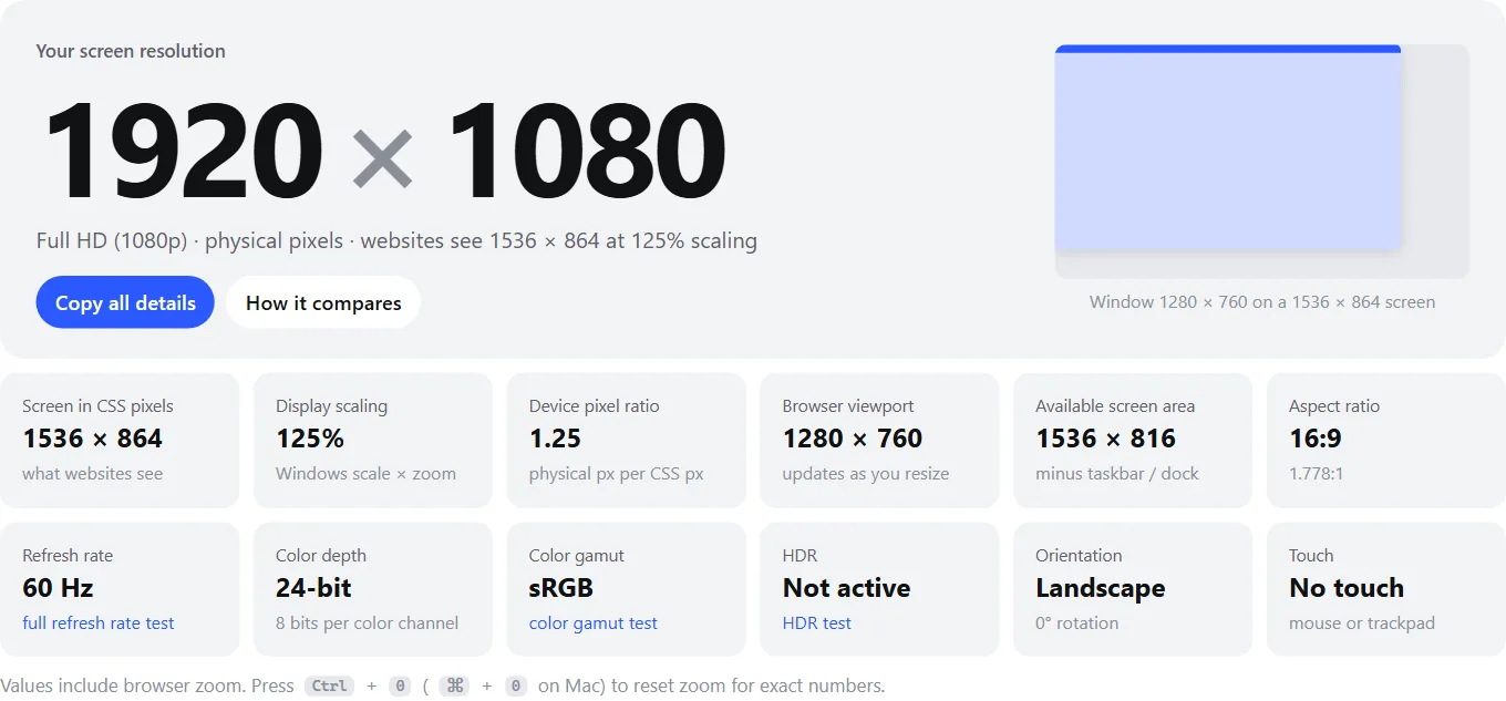
- 1Screen resolution — the real number of pixels on the panel. This is what spec sheets list.
- 2CSS pixels — the screen size after scaling. Websites lay pages out in these units.
- 3Scaling — how much larger than 100% everything is drawn (OS scale × browser zoom).
- 4Viewport — the visible page area of this browser window. It changes as you resize.
| Value | What it is | Where it comes from |
|---|---|---|
| Screen resolution | Physical pixels across × down. On Windows this matches the resolution in Settings. | CSS screen size × device pixel ratio |
| Screen in CSS pixels | The screen size in the scaled units that web pages and apps lay out in | screen.width × screen.height |
| Display scaling / DPR | Physical pixels per CSS pixel. 125% scaling = 1.25. | devicePixelRatio |
| Viewport | The area inside the browser window that shows the page (no tabs, toolbars or taskbar) | innerWidth × innerHeight |
| Available area | The screen minus permanent system bars such as the Windows taskbar or macOS Dock and menu bar | screen.availWidth × availHeight |
| Color depth | Bits per pixel the browser reports. 24-bit means 8 bits each for red, green and blue. Many browsers report 24 even on 10-bit panels. | screen.colorDepth |
| Color gamut / HDR | Whether the screen and browser currently support wide color (Display P3, Rec. 2020) and high dynamic range | CSS media queries |
Why does it say 1536 × 864 (or another odd size)?
Modern screens pack so many pixels into a small area that text would be tiny at a 1:1 size. So your operating system scales everything up: at 125% scaling, a 16-pixel letter is drawn with 20 physical pixels. Your screen keeps its full resolution — text is just sharper, not smaller.
Websites and apps, though, work in scaled “CSS pixels”. Divide the physical resolution by the scale factor and you get the size they see: 1920 ÷ 1.25 = 1536 and 1080 ÷ 1.25 = 864. That is why analytics tools are full of “resolutions” like 1536 × 864 and 1280 × 720 that are really 1080p laptops.
| Websites see | Real screen | Why |
|---|---|---|
| 1536 × 864 | 1920 × 1080 | 125% scaling — common default on 14–15.6″ Windows laptops |
| 1280 × 720 | 1920 × 1080 | 150% scaling — common on 13–14″ laptops |
| 2048 × 1152 | 2560 × 1440 | 125% scaling |
| 1707 × 960 | 2560 × 1440 | 150% scaling (2560 ÷ 1.5 = 1706.7, rounded) |
| 2560 × 1440 | 3840 × 2160 | 150% scaling — typical for a 27″ 4K monitor |
| 1920 × 1080 | 3840 × 2160 | 200% scaling — typical for 4K laptops and 24″ 4K monitors |
| 1280 × 800 | 2560 × 1600 | 200% scaling |
| 1512 × 982 | 3024 × 1964 | MacBook Pro 14″ default (2×) |
| 1470 × 956 | 2560 × 1664 panel | MacBook Air 13″ default; macOS renders 2940 × 1912 and scales it down |
| 393 × 852 | 1179 × 2556 | iPhone 15 and 16 (3×) |
| 390 × 844 | 1170 × 2532 | iPhone 12, 13 and 14 (3×) |
Browser zoom stacks on top of system scaling: at 125% scaling and 110% zoom, the device pixel ratio is 1.375. Reset zoom (Ctrl + 0) before trusting the numbers above.
Common screen resolutions
If your screen matches one of these, its row is highlighted.
| Name | Resolution | Aspect ratio | Megapixels | Typical use |
|---|---|---|---|---|
| HD (720p) | 1280 × 720 | 16:9 | 0.9 | Budget TVs, 720p video |
| WXGA | 1366 × 768 | ≈ 16:9 | 1.0 | Budget and older laptops |
| HD+ | 1600 × 900 | 16:9 | 1.4 | Budget laptops |
| Full HD (1080p) | 1920 × 1080 | 16:9 | 2.1 | Most monitors and laptops, TVs, consoles |
| WUXGA | 1920 × 1200 | 16:10 | 2.3 | Business laptops and monitors |
| QHD (1440p) | 2560 × 1440 | 16:9 | 3.7 | 27″ monitors, gaming |
| WQXGA | 2560 × 1600 | 16:10 | 4.1 | 13–16″ laptops, tablets |
| UW-FHD | 2560 × 1080 | 21:9 | 2.8 | 29″ and budget 34″ ultrawides |
| UWQHD | 3440 × 1440 | 21:9 | 5.0 | 34″ ultrawide monitors |
| 4K UHD | 3840 × 2160 | 16:9 | 8.3 | TVs, 27–32″ monitors |
| DQHD | 5120 × 1440 | 32:9 | 7.4 | 49″ super-ultrawide monitors |
| 5K | 5120 × 2880 | 16:9 | 14.7 | 27″ 5K monitors (e.g. Apple Studio Display) |
| 8K UHD | 7680 × 4320 | 16:9 | 33.2 | 8K TVs |
More pixels only look sharper if the screen is small enough or you sit far enough away — what matters is pixel density. Use the PPI calculator to compare, and the aspect ratio calculator to work out sizes for other shapes.
How to check and change your screen resolution
Always pick the native resolution — the panel’s physical pixel count. Anything else is stretched and looks soft. If text is too small or too large, change the scale instead.
Windows 11
- Right-click the desktop and choose Display settings (or Settings → System → Display).
- With several monitors, select the one to change at the top.
- Under Scale & layout, pick Display resolution — the native one is marked (Recommended).
- Adjust Scale on the same page to make things bigger or smaller.
Windows 10
Right-click the desktop → Display settings → Scale and layout → Display resolution. The Recommended entry is native. Scaling is the Change the size of text, apps, and other items setting just above it.
macOS
Apple menu → System Settings → Displays, then choose a size from Larger Text to More Space. These are scaled modes; to see exact numbers, Control-click the size options and choose Show List. To see the panel’s native resolution, hold Option, open the Apple menu → System Information → Graphics/Displays, which lists both the resolution and what the UI “looks like”.
iPhone and iPad
You can’t change the resolution — iOS always uses the full panel. You can make everything larger with Settings → Display & Brightness → Display Zoom (some iPads offer More Space there too), or just the text with Text Size. Your model’s exact resolution is on Apple’s tech specs page.
Android
Some phones, including many Samsung Galaxy flagships, let you lower the rendering resolution to save battery: Settings → Display → Screen resolution (HD+, FHD+, WQHD+). On every Android phone, Settings → Display → Display size and text (Samsung: Screen zoom) changes the scaling, which changes what websites see.
ChromeOS
Settings → Device → Displays. Use Display size to scale the built-in screen, or the Resolution menu for an external monitor. Shortcuts: Ctrl + Shift + + / − change the display size, Ctrl + Shift + 0 resets it.
Linux (GNOME)
Settings → Displays → Resolution and Scale. Fractional scaling (125%, 150%) may need to be enabled first, depending on your distribution.
Multiple monitors
A browser only sees the screen its window is on. Drag this window to another monitor and the numbers above update to that display, including its own scaling and refresh rate. Each monitor can have a different resolution and scale, which is why a window can jump in size when you drag it across.
For the sharpest result on mixed setups, set each monitor to its native resolution and use scaling to match text sizes — for example a 27″ 4K monitor at 150% next to a 27″ 1440p monitor at 100% gives identical text sizes (both are 2560 × 1440 in CSS pixels), with sharper text on the 4K screen.
Is something wrong with your screen?
Resolution only tells you how many pixels there are. To check that they all work, run the dead pixel test; if text looks blurry or has color fringes, the text clarity test shows whether you are running at a non-native resolution or awkward scaling.
Frequently asked questions
What is my screen resolution?
It is the big number at the top of this page, detected the moment the page loads. It shows your screen in physical pixels (for example 1920 × 1080). Below it you will see the smaller “CSS” size that websites see after display scaling, and your current browser window size.
Why does my 1080p laptop show 1536 × 864?
Because Windows is scaling the display to 125%. Everything is drawn 1.25 times larger so text is readable, so websites see 1920 ÷ 1.25 = 1536 by 1080 ÷ 1.25 = 864 “CSS pixels”. Your screen is still 1920 × 1080; you can check under Settings → System → Display → Scale.
Is the screen resolution the same as the browser window size?
No. Screen resolution is the whole display. The viewport is only the part of the browser window that shows the page, so it is smaller — minus the tabs, address bar, taskbar and any window borders. Web designers usually care about the viewport; buying and settings questions are about the screen resolution.
What is the best screen resolution to use?
Your display’s native resolution — the one Windows labels “Recommended”. Any other resolution has to be stretched to fit the physical pixels, which makes text soft. If things look too small at native resolution, increase the scaling percentage instead of lowering the resolution.
Why does my Mac show a different resolution from Apple’s specs?
In the default “scaled” modes, macOS draws the desktop at twice the size you picked and then shrinks it to fit the panel. A 13-inch MacBook Air, for example, renders 2940 × 1912 for its 2560 × 1664 panel. This page shows the rendered size; System Information → Graphics/Displays shows both.
What is device pixel ratio (DPR)?
The number of physical pixels per CSS pixel. A DPR of 1 means no scaling; 1.25 means 125% scaling; 2 is a Mac Retina or similar HiDPI screen; most current phones are 2.5 to 3. Browser zoom also changes it, so reset zoom with Ctrl + 0 (⌘ + 0 on Mac) for an accurate reading.
Can a website see my screen resolution?
Yes — every website can read your screen size, pixel ratio and window size with JavaScript; that is how this page works. This page does it entirely in your browser and does not send or store the results anywhere.
Last updated . Runs entirely in your browser — nothing is uploaded.