How to run the text clarity test
- Reset browser zoom with Ctrl+0 (⌘+0 on Mac). The bar under the test shows your device pixel ratio and scaling.
- 1:1 pixels: sit at your normal distance. Each tile is drawn one device pixel at a time and should look like a flat, even gray. Lean in and you should see a fine, regular texture. Waves, stripes, blotches or a soft blur mean something is resampling the image.
- Sharpness: the patterned tiles sit on a gray chosen to match their average brightness. With the monitor’s sharpness set correctly they almost disappear into it. Bright or dark outlines around the tiles mean sharpness is too high.
- Subpixels: pick the sample that looks cleanest. That tells you the panel’s subpixel order and whether subpixel text rendering helps or hurts.
- Text: read the samples at every size, black-on-white and white-on-black, after each change you make.
Reading the 1:1 pixel view
| What you see | Meaning | Fix |
|---|---|---|
| Smooth, even gray tiles; fine texture up close | Pixels map 1:1 — the ideal | Nothing to do |
| Regular stripes or waves across a tile (moiré) | The image is scaled by a non-integer factor somewhere | Set native resolution; check monitor/TV scaling and overscan |
| Soft, gray mush with no texture even up close | Upscaled or blurred — common on TVs and in macOS scaled modes | Native resolution, “Just Scan”/“Screen Fit”, integer scaling |
| Vertical lines look different from horizontal lines | Normal on stripe LCDs and many OLEDs; strong color tint points to subsampling | Check the chroma tiles in Sharpness |
| Patterns flicker or shimmer | Inversion artifacts or FRC dithering on some LCDs — not a scaling issue | Usually harmless |
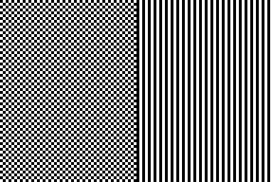 Native, 1:1 — crisp and regular
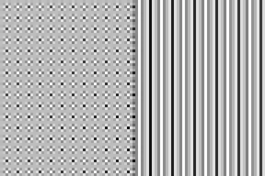 Upscaled ×1.33 — e.g. 1080p sent to a 1440p monitor
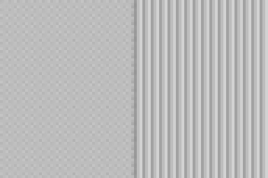 Downscaled ×0.75 — e.g. a macOS “looks like” mode
The canvas measures its exact size in device pixels (where the browser supports it), so these tiles stay 1:1 even when the page itself is scaled. If the bar under the test says your scaling is 125% or 150%, the patterns are still exact — but everything else on screen, including this text, is being drawn at a fractional scale. That is normal and usually fine for text, which is redrawn at the new size rather than stretched. What is not fine is a monitor or TV that is fed a resolution other than its native one: the panel then has to stretch every frame, and nothing on the computer can make it sharp again. Our screen resolution checker shows what your computer is sending.
Sharpness and chroma tiles
The background gray (sRGB 188) has the same light output as a 50/50 mix of black and white pixels, so on a correctly set up screen the checkerboard and line tiles blend into it. If the tiles look clearly brighter or darker than the background, your gamma is off — see the gamma test. If they have halos at their edges, lower the sharpness setting step by step until the halos disappear.
The two colored tiles check chroma subsampling, which mostly affects TVs used as monitors. They alternate 1-pixel red and blue columns (and rows). With full 4:4:4 color you can still make out fine stripes up close. With 4:2:2 the columns smear into flat purple; with 4:2:0 both tiles do — and colored text everywhere looks blurry. On most TVs you fix this by switching the HDMI input to PC mode (LG: set the input’s icon to “PC”; Samsung: enable Input Signal Plus and set the input to PC; Sony: enable Enhanced format for the input) and making sure the cable and port support the bandwidth.
Subpixel layouts
Every pixel is built from smaller red, green and blue elements. Text renderers can use those to place edges at a third of a pixel (Windows ClearType does this) — but only if they know the layout. These are the common ones:
Simplified diagrams. Exact shapes, sizes and order vary between panel generations. The dashed square marks one pixel.
The detector works without a magnifier because of how the red/cyan pairs land on the panel. On an RGB panel, a cyan pixel next to a red pixel lights green-blue-red in a row: three neighboring subpixels that read as one thin white line. On a BGR panel the same pair lights subpixels with a gap between them, so the line looks wider and fringed. Each sample is built for one layout, so the one that looks cleanest is yours. If none looks clean, you most likely have an OLED or a high-density screen, where grayscale antialiasing is the right choice.
Make text sharper
Windows
- Native resolution: Settings → System → Display → Display resolution — choose the one marked “(Recommended)”.
- Scaling: same page, Scale. Use the recommended value. 100% and 200% map most cleanly; 125% and 150% are fine for text on Windows because apps redraw rather than stretch, but some older apps go blurry — fix those per app under Properties → Compatibility → Change high DPI settings.
- ClearType: press Start, type Adjust ClearType text, make sure Turn on ClearType is ticked, and pick the clearest sample on each page. Run it separately on each monitor.
macOS
- Pick an exact 2× mode: System Settings → Displays. On a 4K monitor “looks like 1920 × 1080” is exact 2×. Other “looks like” sizes render larger and scale down — usable, slightly softer, and the 1:1 tiles show moiré.
- Font smoothing: macOS uses grayscale antialiasing only. If text looks too heavy on a standard-density monitor, you can turn smoothing off in Terminal with
defaults -currentHost write -g AppleFontSmoothing -int 0and log out (usedefaults -currentHost delete -g AppleFontSmoothingto undo).
Monitor and TV settings
- Set sharpness to neutral (see the Sharpness view) and turn off “super resolution”, “edge enhancement” or similar filters.
- On a TV, turn off overscan (“Just Scan”, “Screen Fit”, “Fit to Screen”, “Full Pixel”) and use PC or Game mode.
- Use a cable and port that carry full resolution and refresh rate without subsampling.
Pixel density matters more than any setting. A 27-inch 1440p monitor (about 109 PPI) or a 24-inch 1080p monitor (about 92 PPI) shows visible pixel structure at desk distance; a 27-inch 4K (about 163 PPI) at 150% looks clean on any OS. Compare screens with the PPI calculator.
OLED text fringing
QD-OLED and WOLED monitors often show colored edges on text — green and magenta on horizontal edges with QD-OLED, red and blue tints with WOLED. It is a property of the subpixel layout, not a defect, and every unit of a model shows it equally. It is most visible on low-density panels (34-inch ultrawide 1440p, 27-inch 1440p) and from up close, and less visible at 4K. Grayscale antialiasing (turn off ClearType, or use a third-party renderer such as MacType on Windows) reduces it. If you are sensitive to it, prefer a higher-PPI model. The viewing angle test and the OLED test cover the other OLED trade-offs.
Frequently asked questions
Why does text look blurry on my monitor?
The usual causes, in order: the computer is not sending the monitor’s native resolution; Windows or macOS is scaling by a non-integer amount; the monitor’s sharpness setting is wrong; ClearType is tuned for a different subpixel layout; or, on a TV, the signal is chroma-subsampled (4:2:2 or 4:2:0). The 1:1 pixels view shows the first two at a glance — the checkerboard should look like a smooth, even gray.
What is 1:1 pixel mapping?
It means each pixel the computer draws lands on exactly one physical pixel of the panel. That only happens at the panel’s native resolution with no scaling anywhere along the way — not in the browser, the operating system, the graphics driver or the monitor. Any resampling turns a 1-pixel checkerboard into moiré, bands or blur.
How do I know my subpixel layout?
Open Subpixels and pick the sample whose lines look thinnest and whitest and whose text looks sharpest without color fringes. The pattern built for your layout lines up three adjacent subpixels into one thin white line; the wrong ones spread over five subpixels and show red and cyan edges. For certainty, take a zoomed-in phone photo of a white area — you will see the subpixels directly.
Should I turn ClearType off?
On a standard RGB-stripe LCD, keep ClearType on and run the ClearType Text Tuner. On OLED monitors (QD-OLED and WOLED), rotated monitors and BGR panels, ClearType’s colored edges can look worse than plain grayscale smoothing — try both in the tuner and keep the one you prefer. On 4K screens at 150–200% scaling, the difference is small either way.
Why does text look worse on my Mac with an external monitor?
macOS dropped subpixel antialiasing in macOS Mojave, so text on low-density (around 100 PPI) monitors looks softer than it does on Windows. macOS is designed for about 220 PPI at exact 2× scaling. A 27-inch 4K monitor set to “looks like 1920 × 1080” is pin-sharp; “looks like 2560 × 1440” renders at 5K and scales down, which is slightly softer.
Why do OLED monitors have colored fringes on text?
OLED panels don’t use the RGB stripe that operating-system text rendering assumes. QD-OLED uses a triangular layout and WOLED uses four subpixels (red, white, blue, green), so subpixel-antialiased text gets green, magenta or red-blue edges. Higher pixel density, 125–150% scaling, and grayscale antialiasing all reduce it.
What should the sharpness setting on my monitor be?
The neutral value, which is often the default (frequently 50 on a 0–100 scale, or 0 on TVs — check your model). Too high adds bright or dark halos around edges; in the Sharpness view the tile edges start to stand out from the gray. Too low smears fine detail. On TVs used as monitors, set sharpness to 0 and use the PC or Game input mode.
Last updated . Runs entirely in your browser — nothing is uploaded.